Column · @quietgreenwalls
What wall colors work well behind natural moss textures?
Choosing the right wall color for preserved moss art
The wall color behind a preserved moss piece can change how the texture reads and how the whole room feels. A thoughtful color choice makes the moss look richer, while a poor one can wash it out or create visual noise. The direct answer is that neutral, earthy, and deep tones work best, but the exact shade depends on the room’s light, the moss’s own color, and the mood you want to create.
Moss brings a natural, organic texture that is neither flat nor uniform. Its surface catches light unevenly, with tiny peaks and valleys that create depth. A wall color that competes with that texture, for example, a busy pattern or a very bright hue, can make the moss look muddy or disappear. On the other hand, a wall that is too dark may absorb the moss entirely, especially if the moss is a deep green. The goal is to find a background that lets the moss sit forward without feeling disconnected from the room.
Neutral tones as a safe foundation
Off-whites, warm grays, and soft beiges are the most reliable choices for a background behind moss. They do not fight for attention, and they let the moss’s natural variation stand out. A warm white with a slight yellow or cream undertone can echo the earthy quality of preserved moss, while a cool gray can create a more modern, crisp look. The key is to avoid a stark white, which can make the moss feel isolated or clinical. A slightly muted white, sometimes called a “greige” or “warm stone,” provides a gentle transition between the wall and the organic material.
Neutrals also make it easier to change other elements in the room later. If you swap out furniture or add new artwork, a neutral wall behind the moss will not lock you into a particular palette. This flexibility matters because a framed moss piece is often a long-term installation; it is not something you swap out seasonally. The wall color should serve as a quiet partner to the moss, not as a statement that dates itself.
Earthy and muted greens for harmony
If you want the moss to feel like an extension of the wall rather than a separate object, consider an earthy green. A sage, olive, or muted forest green can create a monochromatic effect that is calming and cohesive. The moss will not pop out as sharply as it would against a white wall, but it will feel integrated into the surface. This works especially well in rooms where you want a natural, grounded atmosphere, a study, a reading nook, or a bedroom.
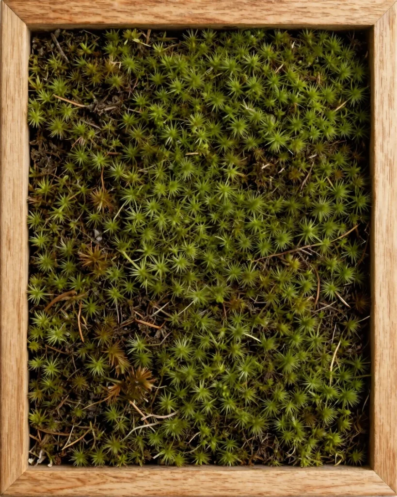
The risk with green is choosing a shade that is too close to the moss’s own color. If the wall and the moss are nearly identical in tone, the moss can disappear visually, losing its definition. To avoid this, pick a green that is either lighter or darker than the moss by at least two steps on a value scale. A light sage wall with a darker preserved moss creates a subtle contrast; a deep charcoal-green wall with a lighter moss gives a dramatic, moody look. Test a sample of the wall color next to the actual moss piece before committing.
Deep blues and charcoal for drama
Dark wall colors, navy, charcoal, deep teal, can make a moss piece feel like a focal point in a room. The contrast between a dark background and the lighter, textured green of the moss draws the eye directly to the art. This approach works best in rooms with good natural light or with dedicated accent lighting, because a dark wall can make a small room feel smaller if it is not balanced.
When using a dark wall, consider the frame. A light or natural wood frame can bridge the gap between a dark wall and the moss, preventing the piece from feeling heavy. A dark frame on a dark wall risks making the entire composition read as a single dark mass, especially in low light. The frame becomes a visual border that separates the moss from the wall, and its color should be chosen with care. A wood framed moss decoration with a light oak or ash frame against a navy wall is a classic combination that feels both natural and refined.
Warm earth tones: terracotta, clay, ochre
For a bolder look, warm earth tones like terracotta, burnt clay, or ochre can complement the green of moss beautifully. These colors share the same natural origin as moss, they come from soil, stone, and plant matter, so the combination feels organic even when it is unexpected. A terracotta wall behind a deep green moss piece can evoke a desert landscape or a Mediterranean courtyard, depending on the rest of the room’s decor.
The challenge with warm tones is that they can clash with certain shades of green. A moss that leans yellow-green may not work well with a red-toned terracotta; the result can feel jarring. Stick with mosses that have a cooler, blue-green undertone if you plan to use a warm wall. Test the combination in the room’s actual light, because artificial light can shift both the wall color and the moss’s appearance. A sample board with the wall paint and a small piece of the moss is the only reliable way to judge the match.
Light and texture considerations
Natural light changes the way a wall color reads throughout the day. A gray that looks soft and warm in the morning may appear cold and flat in the afternoon. Moss, being three-dimensional, casts tiny shadows that shift with the light source. A wall color that looks good under a single light fixture may not hold up in a room with multiple windows. Observe the wall at different times of day before painting.
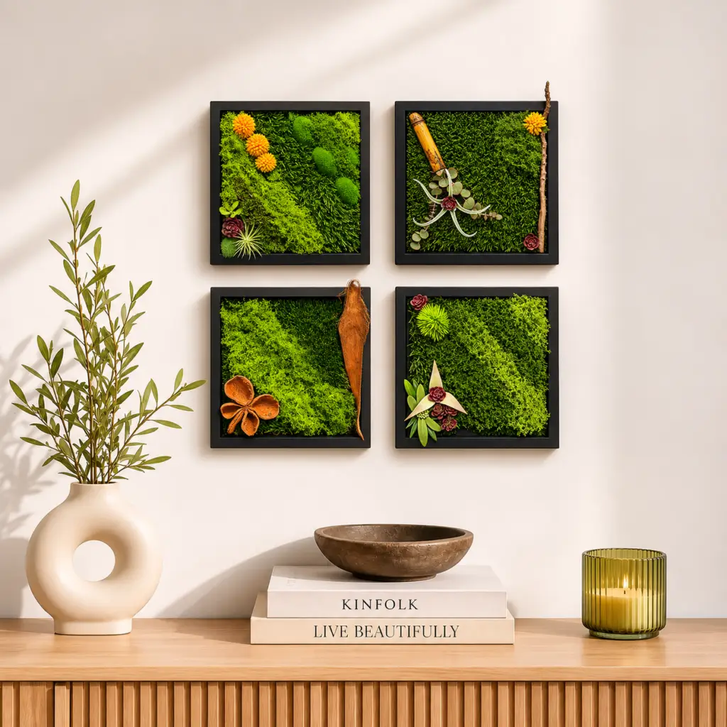
Texture on the wall itself also matters. A smooth wall reflects light evenly, making the moss’s texture stand out more. A textured wall, such as a knockdown or orange peel finish, can compete with the moss for visual attention. If your wall has a pronounced texture, a darker or more saturated color can help unify the surface, while a light color may emphasize the bumps and create a busy backdrop. A flat or matte paint finish is usually best behind moss because it reduces glare and lets the moss’s surface be the star.
How the frame influences the choice
The frame is the bridge between the wall and the moss. Its color, material, and width affect how the wall color reads. A thin black frame can make a moss piece feel modern and graphic, especially against a white or light gray wall. A thick natural wood frame softens the transition and works well with earthy wall colors. A wood framed moss decoration with a dark walnut frame against a cream wall creates a warm, traditional look that fits a living room or hallway.
If the frame is very dark, the wall should be light enough to create a clear silhouette around the piece. If the frame is light, the wall can be darker without losing the shape of the artwork. The frame also affects how the moss is perceived: a wide frame gives the moss a sense of enclosure and importance, while a narrow frame lets the moss feel more open and integrated with the wall. Consider the frame as part of the overall composition, not as an afterthought.
Gallery walls and groupings
When placing moss art in a gallery wall or alongside other pieces, the wall color becomes even more critical. A single moss piece against a neutral wall is forgiving, but a grouping of frames, photos, and objects requires a background that ties them together without competing. A soft neutral or a very muted earth tone works best here because it provides a consistent backdrop for a mix of materials, wood, metal, glass, and moss.
If the gallery wall includes multiple moss pieces, consider using the same wall color throughout the arrangement. Different shades of green on different walls can make the grouping feel disjointed. Instead, let the mosses vary in texture and shade while the wall remains constant. This approach creates visual balance without requiring every piece to match exactly. The wall becomes the unifying element that holds the collection together.
Practical tips for testing
Before painting an entire wall, buy a small sample pot and paint a large square of poster board or foam core. Place the moss piece against it and move the board around the room to see how it looks in different lighting conditions. Look at it during the day with natural light, and again at night with the room’s lamps on. If possible, bring a small piece of the moss to the paint store to hold against the color chips. Many stores will let you take home sample stickers that you can stick to the wall for a few days.
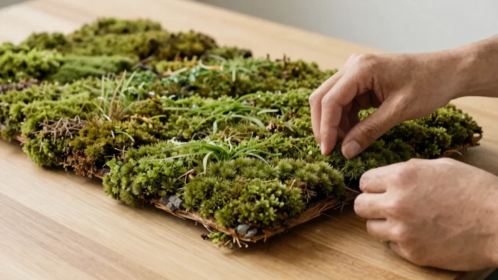
Consider the room’s other fixed elements, flooring, trim, built-in cabinetry. A wall color that works with the moss but clashes with the floor will feel off no matter how good the moss looks. The moss is an addition to the room, not an island. The best wall color is one that connects the moss to the rest of the space without drawing attention to itself.
Preserved moss is a natural material that changes subtly over time as it settles into its environment. The wall color you choose today will likely stay the same for years, while the moss may lighten or darken slightly with exposure to humidity and light. A neutral or earthy wall color gives you room for that shift without making the combination look mismatched later. The goal is not just a good match today, but a pairing that continues to feel right as the room evolves.